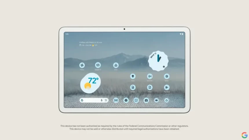
Google has been working hard to improve its apps for first-party developers with large-screen enhancements since I/O 2022, and this effort is set to come to fruition in the company’s Pixel Tablet.
The latest update features a three-column UI for Google Discover on tablets, which is now rolling out to other tablets, including Samsung’s Tab S8, with the Google app 14.2.7.26 (current beta).
9to5Google has demonstrated how Google is making changes to Assistant and Discover to work with users of the Pixel Tablet. Instead of the traditional two content columns, Google Discover has an additional column that makes the feed appear edge-to-edge.
This full-screen effect is particularly evident on the left of the home screen, which now features a black background. Additionally, the profile picture, the Google logo, and the profile picture have been moved to the upper corners, creating a more visually appealing layout. The navigation rail within the Google app has also been improved by removing blank spaces. The feature is now set to be switched over to the Material You style.
As part of the three-column redesign, Google has also decided to place all content in cards with thin outlines and shrink cover images. The width of the cards is equal, but the height is different between rows. This is also true in portrait orientation, where the cards will be arranged in two columns.
In the Pixel Tablet, Google is also scheduled to include rows of media suggestions “From your apps,” similar to the lean-back user experience on Google TV. Users can also colorize the background, enhancing the overall user experience.
Overall, the new three-column UI for Google Discover on tablets is a welcome addition for users and will provide a more streamlined and organized experience. This update shows Google’s commitment to improving its apps for first-party developers. We look forward to seeing the company’s other enhancements for its users.
