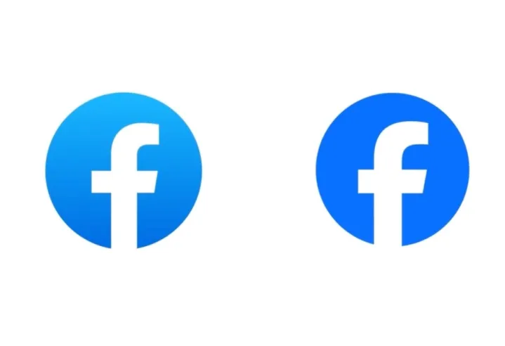
In the world of social media, even tiny changes get everyone talking. So, when Meta, the new owner of Facebook, decided it was time for a facelift, we all leaned in to see what they’d do. But unlike Twitter’s radical transformation into “X,” Facebook’s makeover is more like a new coat of paint on your favorite old car.
Picture this: countless meetings, some stretching way past quitting time—whiteboards filled with scribbles and, of course, a lot of erasing. Discussions are heated enough to make fists pound tables in defense of ideas. After all that effort, we got a logo similar to the old one.

The white “f” on a blue background is as recognizable as a Big Mac at McDonald’s. So, the clever folks at Facebook figured, why change a good thing? They kept that famous white “f” but made some tiny tweaks.
ALSO READ: Facebook’s Meta Releases AI Model for Image Recognition
So, what’s the deal with these changes? Meta’s idea was simple: they wanted a fresh, bold, and timeless logo. They tinkered with the blue color, making it a bit bolder to make the “f” pop more.

Dave N., Facebook’s design chief, explained that they aimed to build upon the existing logo while adding a pizzazz. They wanted it to feel familiar yet fancy, like putting on your favorite sneakers for a night out. These small changes, Dave N. says, make the logo look balanced and, in a way, forward-moving.
“The goal of our work was to expand upon our foundation and create the defining mark of our brand that anchors the identity system across Facebook. We wanted to ensure that the refreshed logo felt familiar, yet dynamic, polished and elegant in execution. These subtle, but significant changes allowed us to achieve optical balance with a sense of forward movement.”
Dave N., Director of Design, Facebook
But it’s not just the logo; they tweaked the Facebook name too. The changes here are so subtle you need a magnifying glass. But these little alterations help Facebook’s name fit in better with the rest of the text and keep the brand’s history alive.

Now, why go through all this trouble for such tiny changes? Remember, Facebook isn’t just a social media giant; it’s a global phenomenon. Over 3 billion people, like a whopping 38.4% of the world, check their Facebook accounts at least once a month.
ALSO READ: Facebook now lets you search by name and location without logging in
In a world where everything changes at the speed of light, Facebook’s choice to keep its core identity intact while freshening up its look shows it understands its users. They know that familiarity is a comforting thing in this ever-changing digital landscape. It may be a minor tweak, but it’s a big nod to Facebook’s commitment to staying recognizable and relevant in social media.
(source/via: the verge ,digitaltrends )


